Why Guinness Advertising Posters Became Iconic

Guinness advertising posters are among the most recognizable images in the history of graphic design. Long before television commercials or digital marketing, Guinness transformed print advertising into popular art, creating posters that are still collected, reproduced, and admired today.
But why did these posters become so iconic—and why do they still resonate nearly a century later?
When did Guinness start advertising?
Surprisingly, Guinness did not advertise at all until 1929, despite being founded in 1759. That year marked a turning point: the company launched its first major advertising campaign with the slogan “Guinness Is Good For You.”
This late entry into advertising worked in Guinness’s favor. Rather than copying existing beer ads, the brand opted for a bold, artistic, and humorous visual language that instantly stood out.
Who designed the famous Guinness posters?
The most influential artist behind Guinness advertising was John Gilroy, who worked with the London agency S.H. Benson throughout the 1930s. His style—simple compositions, strong colors, and visual humor—helped define Guinness’s visual identity for decades.
Unlike many commercial posters of the time, Gilroy’s work felt playful, elegant, and timeless—closer to illustration and fine art than pure marketing.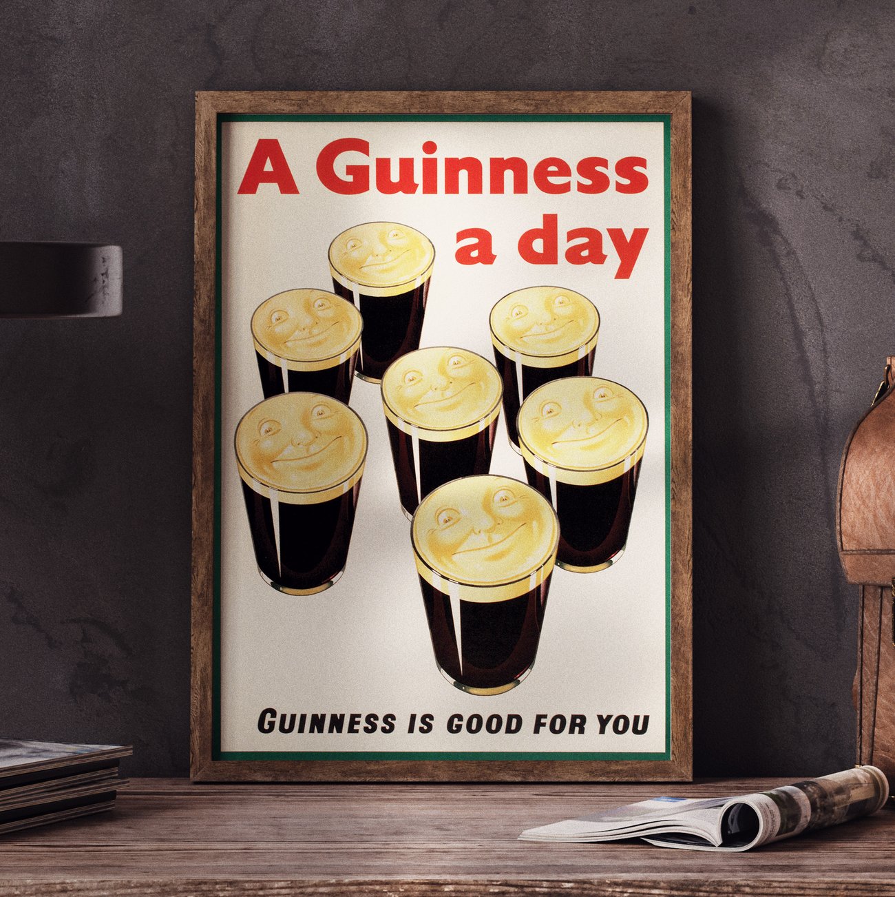
Why does Guinness use animals in its posters?
Guinness posters are famous for their animals, especially the toucan. These characters made the brand friendly, humorous, and instantly recognizable, even without reading the text.
The toucan first appeared in the 1930s, balancing pints of Guinness on its beak.
Beyond the toucan, Guinness posters also featured:
- Lions

- Lobster

- Turtle

- Seals

- Ostriches
- Crab

-
Kangaroos

Each animal reinforced the idea of strength, balance, or vitality, often exaggerated for comic effect.
What are the most famous Guinness posters?
Some Guinness posters have become cultural icons in their own right. Among the most famous:
-
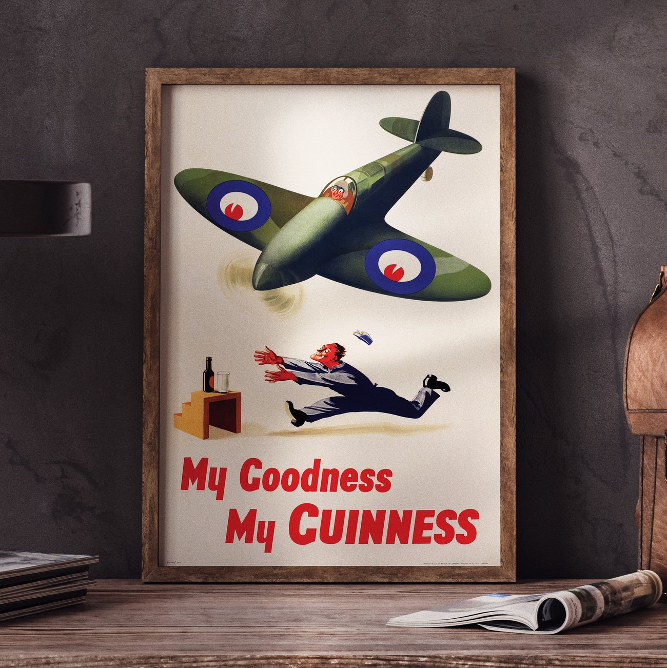
“My Goodness, My Guinness”
-
Guinness Toucan series
-
“Guinness for Strength”
-
“Lovely Day for a Guinness”
-
“Guinness Is Good For You”